Graphic Design
I’ve done design work for friends and on-campus jobs several times, including the mascot for Denison’s Writing Center, the logo of Wesleyan Writers’ Circle, and the covers for Denison’s Prologue and Postscript magazines. These have given me experience creating eye-catching and marketable works.
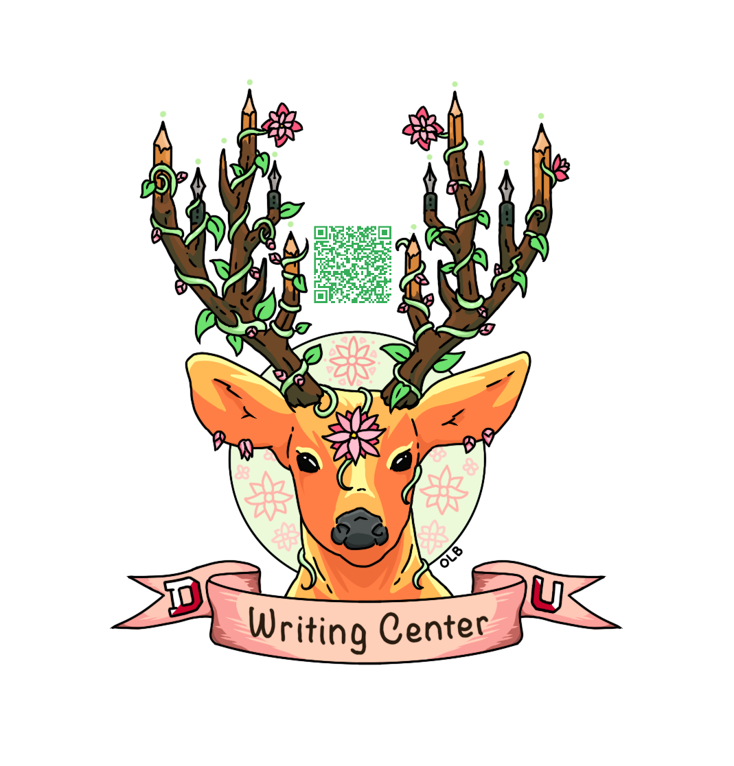
Sticker Mascot: Denison University Writing Center
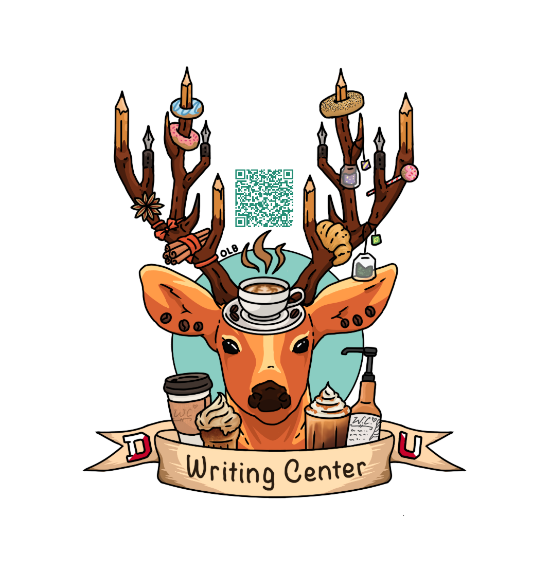
I worked as a consultant at the Writing Center (WC) for four years and was also in charge of designing much of its promotional material, including a mascot and a selection of stickers featuring it to publicize the Center. I adapted Denny Deer — an unofficial mascot of the school, due to the number of deer on campus — to make him WC-specific, with pens and pencils growing out of his antlers and a QR code linking to the WC appointment sign-up page. The designs were done in Procreate and Affinity Designer, and I worked closely with Nicole Green, the WC’s director.
As a marketing strategy, we aimed to make these stickers collectable items that rotated seasonally and were only available during certain times of the year. A few were event-specific, like the Café deer, which was only on offer during the Consulting Café we hosted twice a year. This encouraged people to come to the Writing Center regularly to collect the new deer. As a result, the number of appointments increased severalfold.
Challenges:
The main challenge in creating these stickers was ensuring that the QR code was scannable at a small size on a sticker. As such, we went through several iterations with the QR code in different places to maximize its size while keeping Denny Deer the focus of the sticker (not drawing the viewer’s eyes away to high between the antlers). Initially, I’d planned to put the QR code in the top of the blue circle behind the deer, but this was too small to scan, and the first batch of stickers caused trouble. We solved this by widening the space between the antlers just above the circle and placing a larger QR code there. The idea was also floated that we could put the QR code in the larger space in the sticker’s center between the upper antlers, but this left an odd blank space above the deer’s head that neither of us liked.
I also tend to draw very detailed illustrations (as seen in the RPG illustration gallery), but creating a sticker required me to simplify my color palettes and level of detail so that the deer was still recognizable from a distance and at a small size.
Finally, there was the question of what events merited a deer. At first, I’d imagined creating a deer for every holiday, but after the Halloween deer, we decided not to risk problematically prioritizing some holidays over others, especially since if we included all of them, I’d be doing much more work than I’d initially imagined. In the end, we kept the Halloween deer (as it was already in circulation) but decided not to create any more holiday-specific stickers.
Left to right:
Basic Deer: available all year.
Café Deer: only available at 2x/year Consulting Café.
Autumn Deer: only available during fall.
Winter Deer: only available during winter.
Spring Deer: only available during spring.
Skull Deer: only available the week of Halloween. (Background shown for clarity.)




Logo: Wesleyan Writing Circle
A friend approached me about designing a logo for Wesleyan’s writing club. It would be used for marketing and publicity.
Challenges:
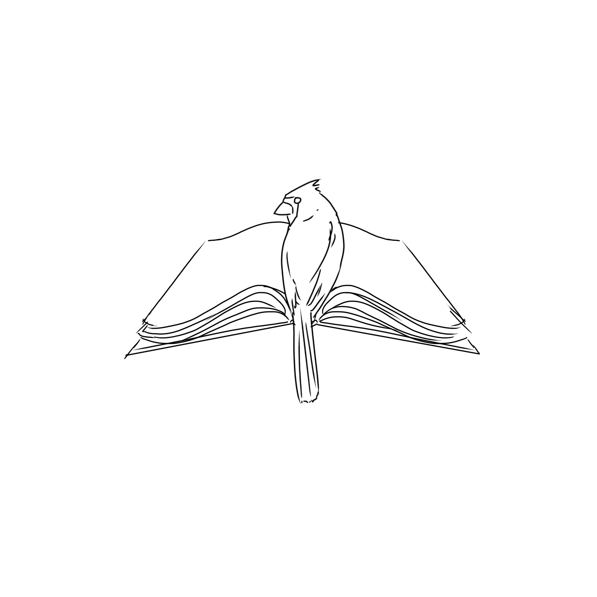
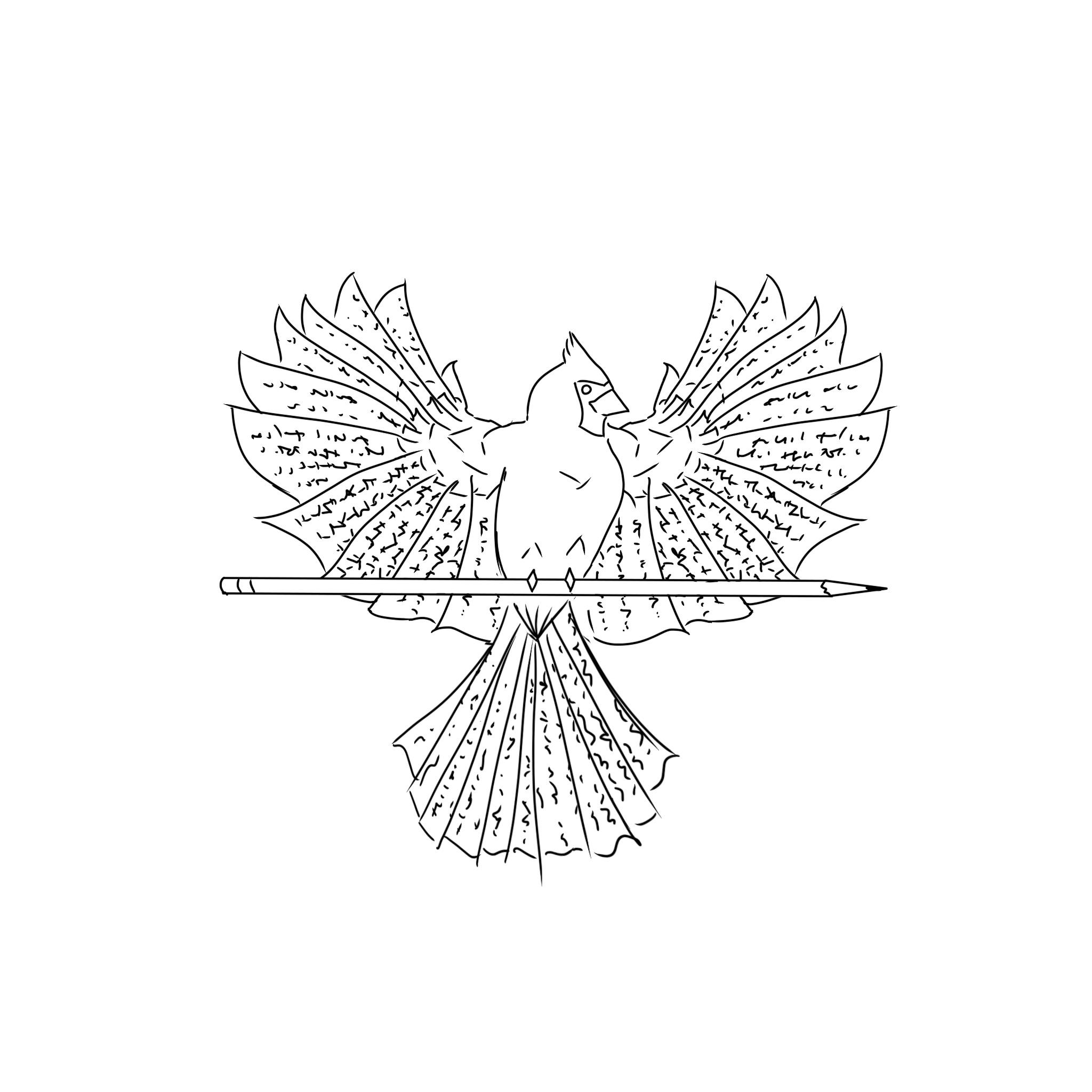
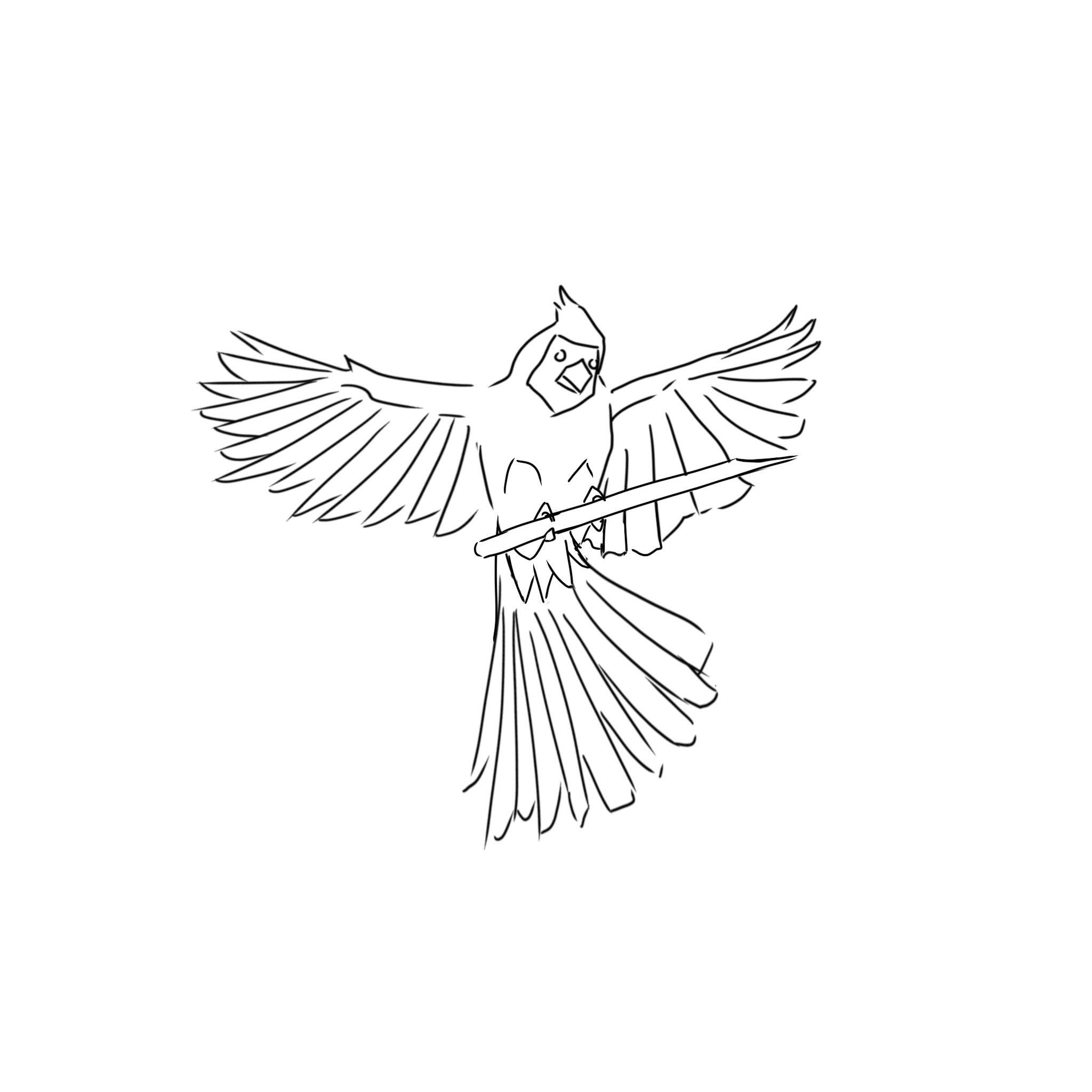
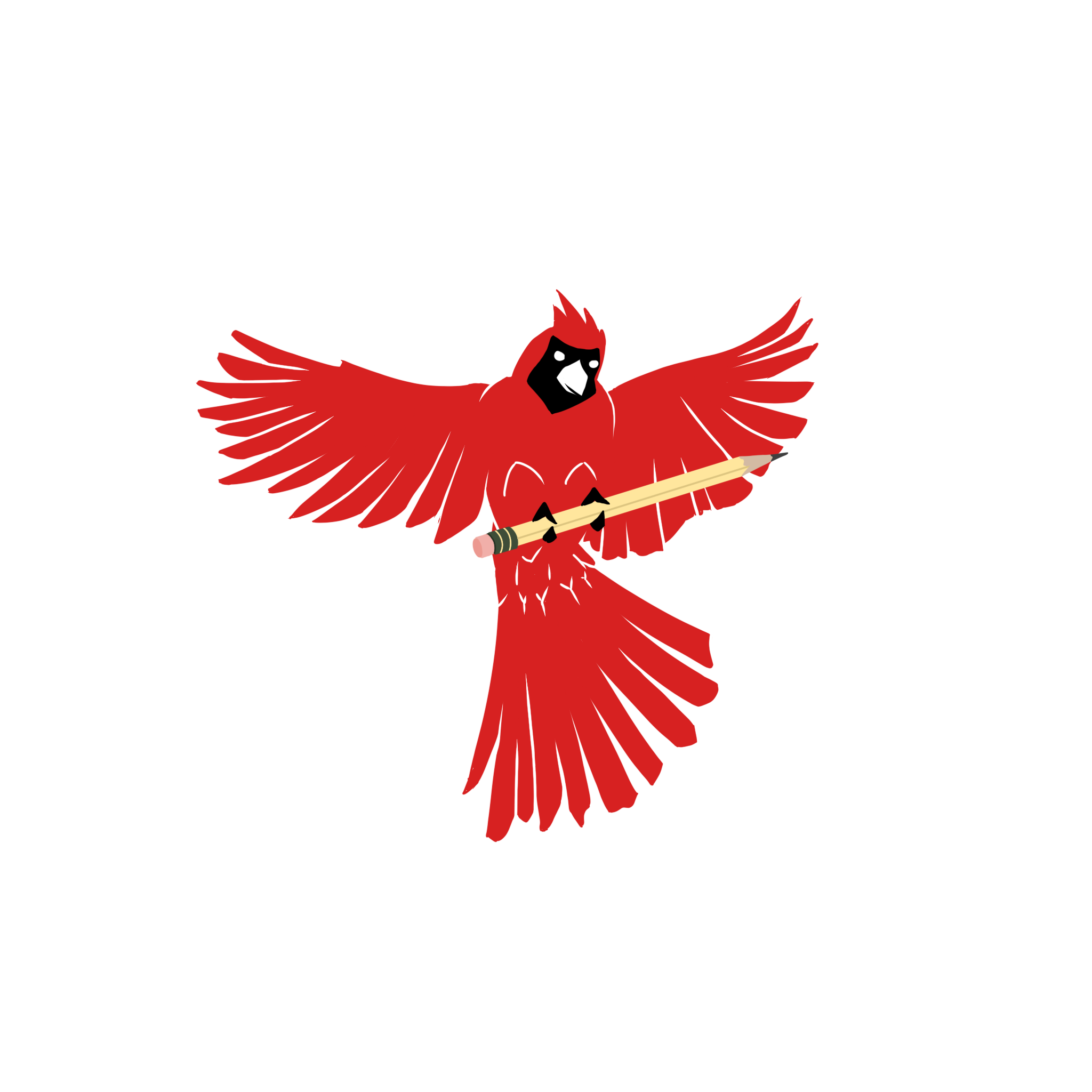
Unlike the Denny Deer stickers, where I had free reign to do whatever I pleased with the design, the Writing Circle had some more specific requests. They brought two ideas: 1) “a white circle with ‘Writing’ curved around the top inside edge and ‘Circle’ curved around the bottom inside, then a cardinal (Wes’ mascot") in the center holding a pen,” 2) the same, but with “the cardinal off to the side and a book in the middle,” and both with the cardinal “writing” the E of “Circle” as though it did the lettering. After some discussion, we nixed the second option given how small the logo would need to be, but I sketched an alternate version with a book and a cardinal for consideration anyway. We then went through several rounds of sketches and feedback before settling on a logo. The drawing was done in Procreate and the text added in Affinity Designer.
This was also the first time I had done a drawing without outlines and instead leaving blank space to create the image, which was an interesting challenge.
Left to right:
Images 1-3: preliminary sketches of the logo.
Image 4: final illustration, pre-text.
Below: final design.
Covers: Prologue and Postscript (2024)
Prologue and Postscript are Denison’s respective freshman- and senior-specific literary journals. Prologue contains outstanding first-year work, while Postscript contains an excerpt from every senior creative writing major’s thesis (mine included!).
The Writing Center is in charge of both Prologue and Postscript, so I worked with one of my fellow consultants to design these covers.
Prologue
Challenges:
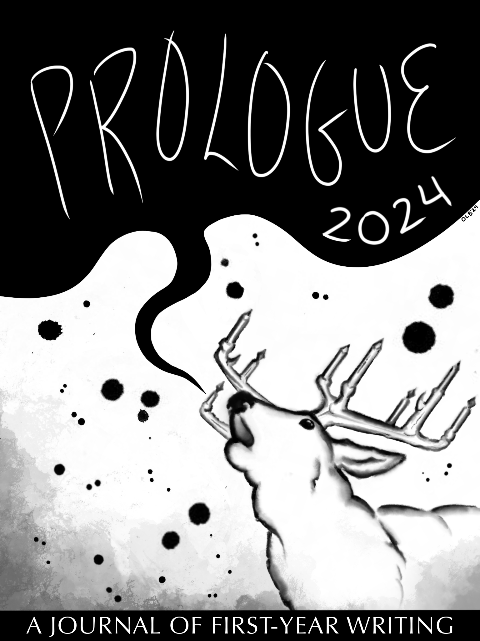
Because these journals are so closely linked to the Writing Center, I once again turned to Denny Deer for Prologue’s design. From the start, I imagined the deer with a speech bubble speaking the name of the journal, but the trouble came in how to color it. My first attempt was a clean outline featuring the same colors as the WC sticker logo — essentially just an alternate angle on the same deer. But as I sketched it out, this felt somewhat uninspired; surely Prologue shouldn’t be an exact replica of the WC mascot — it was a cover, not a sticker.
I then turned to more creative options, first attempting a purplish color scheme that simply didn’t fit, then experimenting with less defined outlines and more of an “inky” look. The latter I found more promising, and I ultimately went with this inked-sketch, blotted-background look that served the cover much better: both a clear reference to the WC and a design of its own more befitting of a cover rather than a sticker.
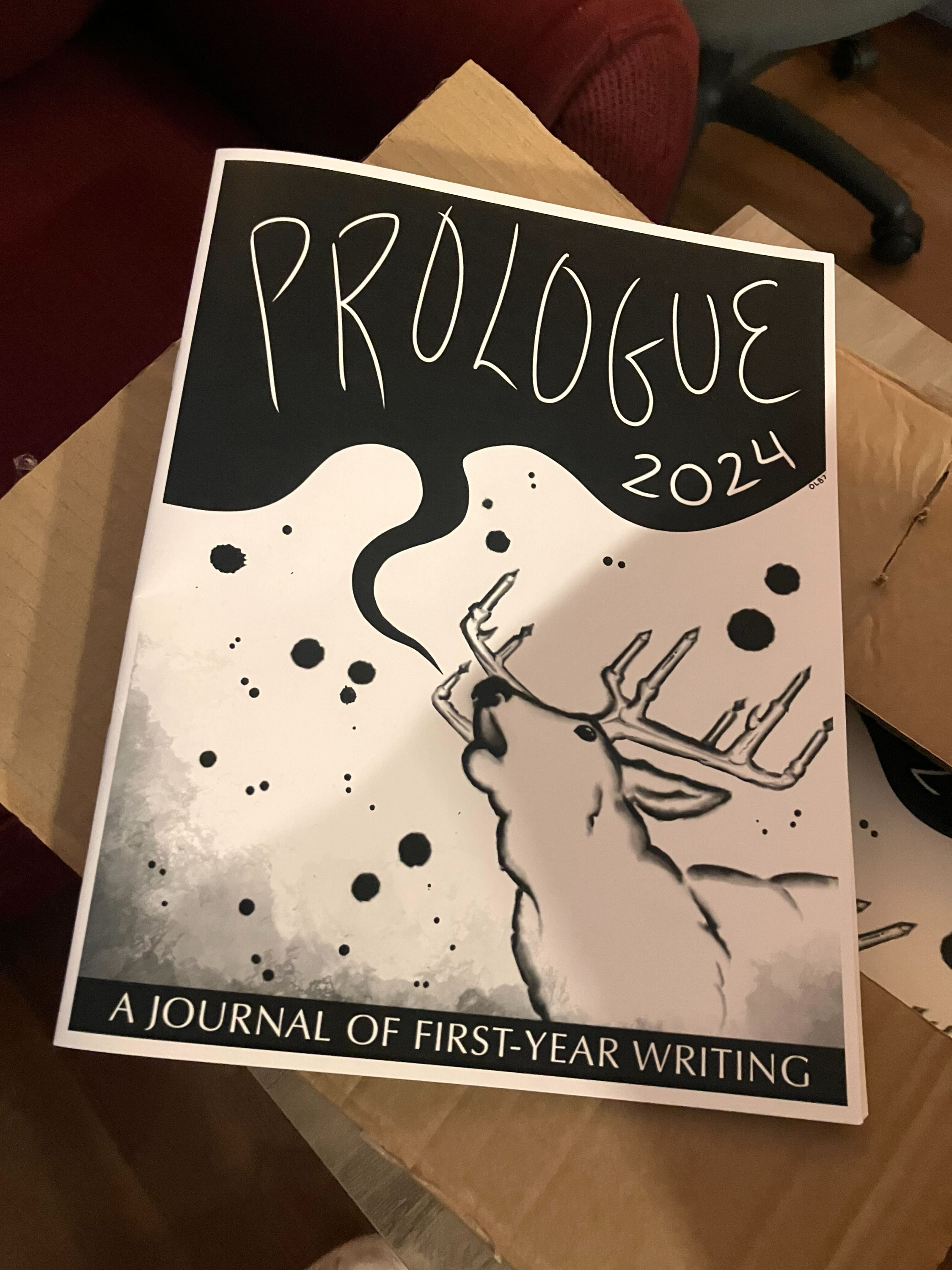
Another challenge was the placement of text and font on the cover. The word “Prologue” was set in its bubble, but the subtitle “A Journal of First-Year Writing” was not. We tried placing it to the left of the deer and below “Prologue” in the bubble, but ultimately decided on adding a strip at the bottom of the image for the subtitle. We then cycled through many fonts to finally land on a nice sans-serif.
Left to right:
Final drawing.
End product.
Postscript
Challenges:
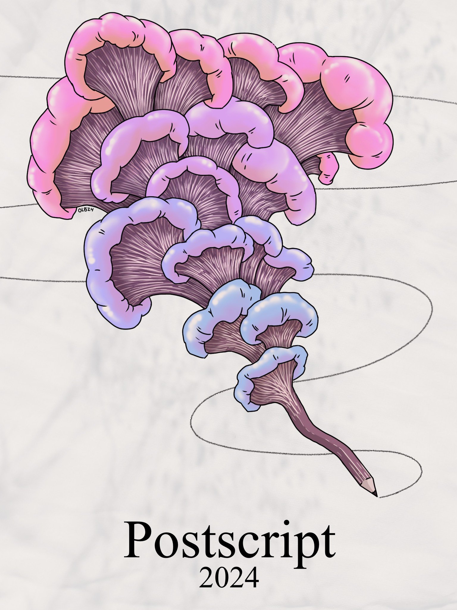
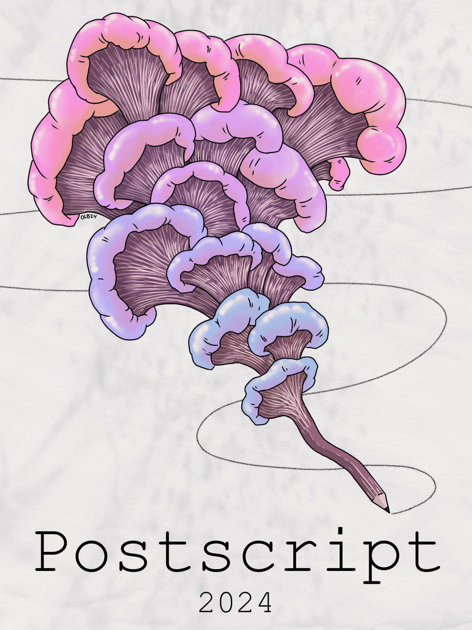
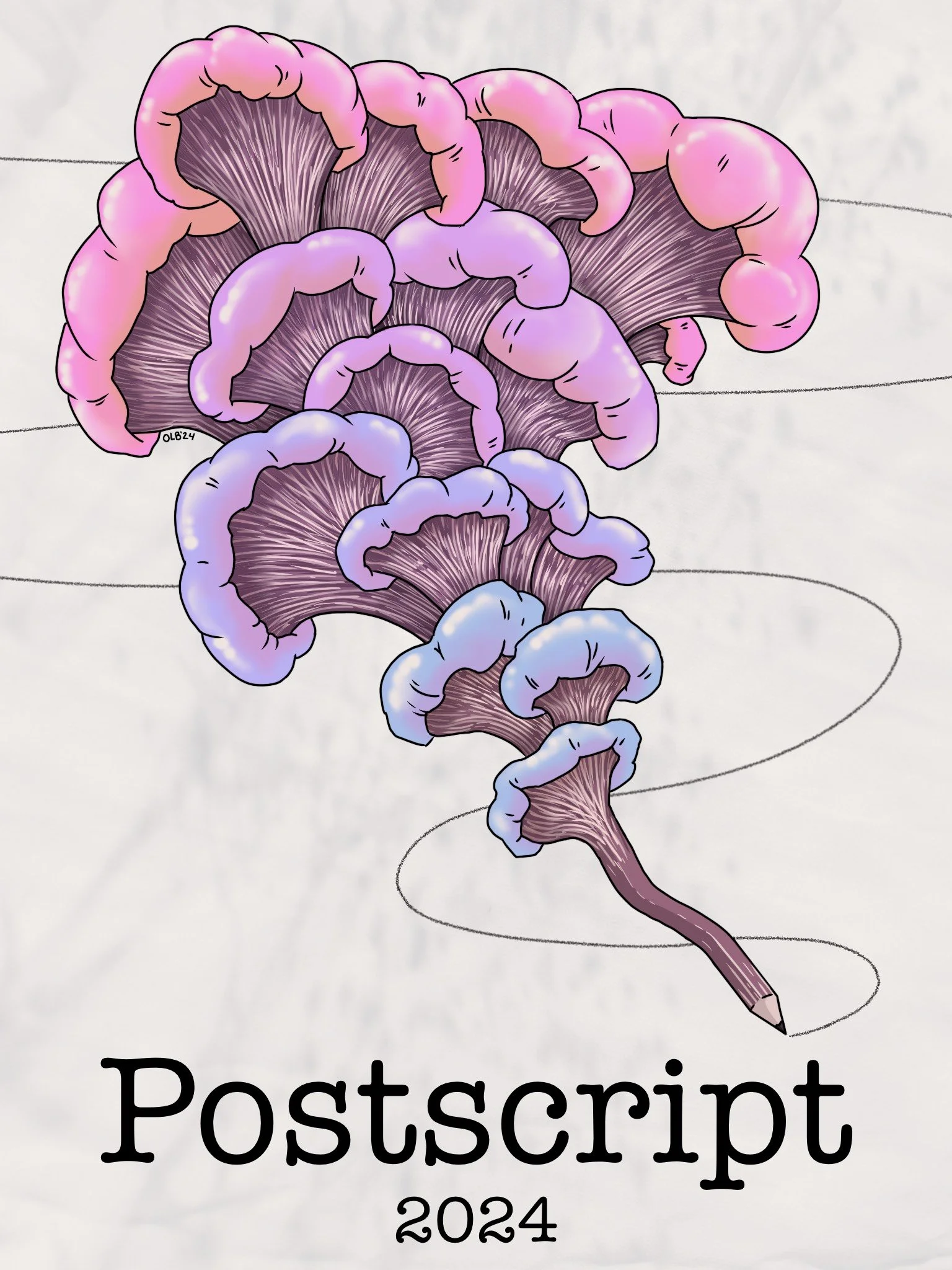
I was basically left to my own devices to design this cover, which was an interesting undertaking. I wanted something that implied flourishing and growing, indicating that the seniors whose work the book contains are spreading their creativity into to greater things in the world beyond Denison. I ultimately settled on a colorful mushroom-like design blooming out of a pencil. The challenge was finding a background that fit the image but didn’t overshadow it; my collaborator and I went through several different iterations before settling on a background evoking creased paper (upon which the pencil is writing). We once again deliberated for a long time over text design and settled on a calligraphy-like font.
Unfortunately, we only found out too late that the proportions of the image did not fit the proportions of the printed product, and the top of my drawing was cut off — frustrating, since if I’d known, I could have worked the cutoff into the design. Oh well!
Left to right:
1-3: background alternative options.
4-6: text alternative options.
Above: final version. Unfortunately, a chunk of the illustration’s top was cut during printing.


